

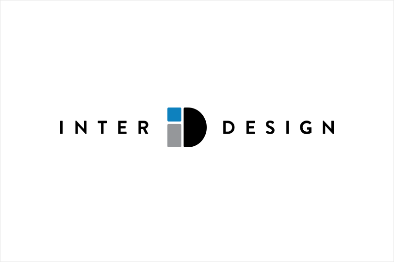
InterDesign
InterDesign is all about invention and innovation. Their products are for the home categories including Bath, Kitchen and Storage. A lot of what went into their logo comes from the imagination and ingenuity surrounding their product line.
Influenced by the geometric-style sans serif faces that were popular during the 1920s and 30s, Brandon Grotesque is based on the same geometric forms found in the logo mark. Leveraging Gestalt Principles, these separate shapes come together to form a complete whole or singular idea. The active spot of blue is both engaging and suggests deeper contemplation.